Seth MacFarlane created the animated series Family Guy for the Fox Broadcasting Company. It features the Griffin family residing in the made-up Rhode Island city of Quahog.
Meaning and History
The comedy was first imagined in 1995 by Seth Woodbury MacFarlane, who is now well-known as an actor, animator, writer, and producer. He was a student at the Rhode Island School of Design at the time. He created a follow-up to his thesis movie, The Life of Larry. Characters from these early pieces served as the inspiration for The Family Guy.
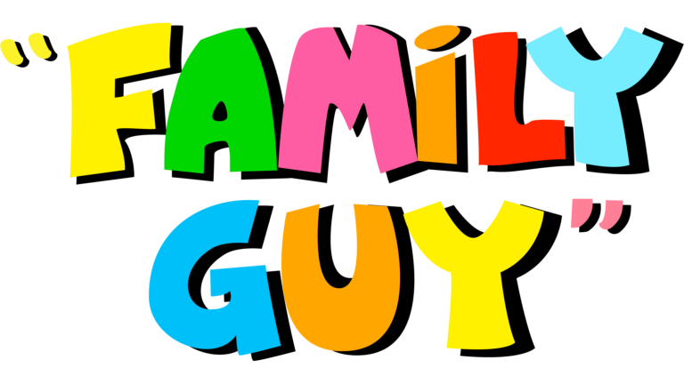
1998 (logo for the pilot)

MacFarlane sent Fox the sitcom’s pilot in the spring of 1998. There was the original Family Guy logo on display. Even if it appeared considerably different from the current one, there are already a lot of parallels.
First off, the letters’ overall shape—plump, sturdy, and somewhat rounded—reminds one of the viewers of Family Guy (especially the males from the Griffin family). This similarity is highlighted on the pilot logo by utilizing different colors for each letter. Each symbol then turns into a cartoon character “dressed up” in outfits of a specific color.
Moreover, the cartoon’s name was enclosed in quotation marks on both sides. They had various hues of color, just like the letters.
Over the deep blue background, the original logo’s vibrant colors were visible. The centre portion was lighter, while the areas near the sides were darker. The writing appeared to have been highlighted as a result of this.
1999

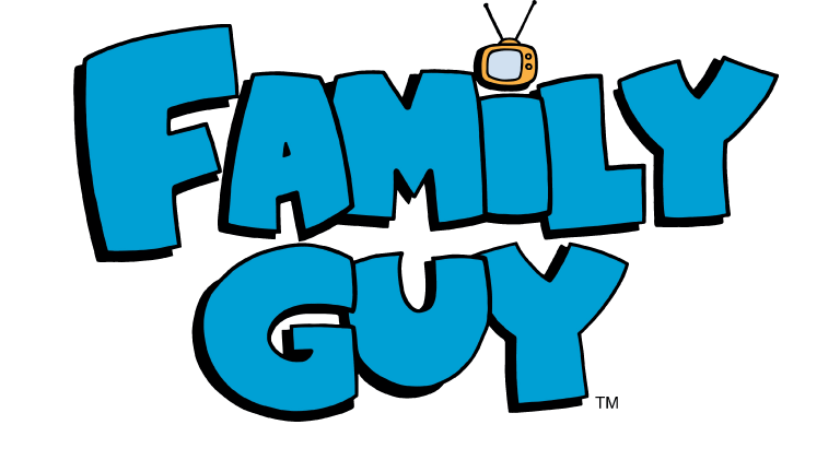
The Fox execs chose to schedule 13 episodes of Family Guy for midseason airing because they loved the brief sample. The animated series debuted this time with a redesigned logo that looked calmer without losing its purpose.
This time, the glyphs were all the same pale blue tint. To give depth, there were also soft black shades.
There were some changes, but the glyphs’ style remained same. Take a look at the “F” and “Y” for examples of how the letters have become a little more rounded and bold.
Although the letters in the Family Guy logo’s pilot were about the same height, the main design took a different tack. The first “F” was capitalized in this case, while the following “G” was a little bigger than the final “U.”
Moreover, there was less room between the glyphs for breathing. The letters became heavier, which could be the cause of this.
The arrival of the TV set was another notable change. It took the place of the generic dot above the letter I
The designers eventually got rid of the quote marks. This simplified and improved the logo’s effectiveness without diluting its intended meaning.
Colors
The Family Guy logo has a lot of vivid light blue. On a sunny, hot summer day, it is very near the shade of the sky. The hue conveys a positive message. Blue is the color of loyalty, thus it stands to reason that the moniker “Family man” matches it perfectly.
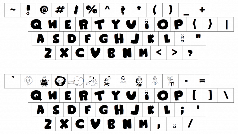
Font


Nice
Giggity Giggity!